Blog
Design Process: Creating the Cover Art for Parachute Journalists
I’m going to show you all how I went about designing the cover art for my band’s new single “24th of January.” Listen/Download for free here. If you aren’t aware, 2/3 of Parachute Journalists are members of Go Media: Jeff Finley (me on drums), and Adam Wagner who’s voice you hear on most of our songs.

We’ve chosen to release one song at a time and make them available for free download. Why? Because we’re producing each song ourselves and admittedly we’d never get our record out if we didn’t. One of the best parts is being able to focus on one song at a time to get something closer to our original vision. And I get to create new and interesting album artwork for every song!
Listen to the song
——-
What you will learn in this tutorial
- Advanced texturing, noise, and grunge effects in Photoshop.
- Classy typography solutions
- Insight into the design process, hacks, cracks, and cheats. :-)
Now, admittedly, I am looking back at my artwork and reverse engineering my design process. I’m going to give you a glimpse of what I did and how I made my decisions. This isn’t exactly a step by step tutorial, but more of a “behind the scenes” look. Enjoy!
Getting Started
The deadline to create the art for this new single was fast approaching and I was still answering boatloads of emails from earlier in the week after I asked my entire customer base their opinion on how I could promote our new Vector Set 18. So I found a free moment late Friday night and cracked open Photoshop and started a new document at 10″ x 10″ at 300 dpi. I make all these covers at least that size in case I want to make prints out of them or create a cool fauxtograph effect which requires a higher res image.
My first idea was to run with a winter theme, being that our title was the “24th of January.” I thought I’d dive in head first in Photoshop and start splashing around until something cool happened. I gave myself an hour before bed feeling cocky like I knew that something awesome would just make itself while I clicked around. I hunted around Deviant Art’s stock photo area hoping something would stand out. At the moment, I was caffeinated and freshly inspired by Janee Meadows after she left me a nice comment on Facebook. I thought for sure greatness was just at my fingertips.
Creative Block
But that wasn’t the case. I couldn’t design anything. I pieced together stock photos and moved around blocks of my favorite typefaces. I even tried saving myself with the cheap retro/grunge tricks that I use to make everything look cool (you’ll have to buy this tutorial to find out), but nothing was working. I had the worst case of designer’s block ever. See below for what I ended up with. Sure it’s not bad, but there’s no meaning behind it and I felt like I was reusing the same fonts and textures and wasn’t what I envisioned.

Perhaps because I didn’t start with a sketch? Perhaps I didn’t even consult with Adam, the one who penned some of our best lyrics? I saved out whatever I had and closed Photoshop. I failed and was super tired (although still buzzing from the coffee I drank earlier). The last drop of energy I had was used on a Facebook post and tweet about how I couldn’t design anything and fortunately a handful of compassionate folks backed me up and said “we’ve all been there.” With that, I went to bed after emailing Adam asking him for some fresh ideas and inspiration.
Starting Fresh
So I spent all day Saturday with my wife on her birthday. It was a much needed break to clear my head. I picked things back up Sunday afternoon. Waiting for me in my inbox was an email from Adam with some meaningful themes and inspiration. Here is what it said:
Recent events have caused me to question my identity again. How do I know that I’m the same soul that fell asleep when I wake up? Maybe my soul was switched, and all memories replaced with those of another person. I’d have no way of knowing. But I’ve certainly felt aware of some strangeness lately. And this isn’t the first time I’ve felt this way. I’m starting to feel like a veteran of this mental world. So, I just kinda roll with it. Paint a few of pictures of the (un)reality I’ve been living in.
Ok. What about a beautiful woman (like a goddess, or angel) performing brain surgery on a dude just sleeping in a dorm room environment? What about a side view of a face, but you can see inside the head like a cross-section, and there’s something frightening in there. Perhaps two howitzer barrels positioned behind the eyes operated by Bill Nye the Science Guy. Or a raccoon on a treadmill. Or a series of pipes & funnels that collect pictures through the eyes, which funnel into a grinder/transformer and make their way into a barrel that’s sticking out the mouth? The devil is operating the machine.
Immediately a light bulb turned on after reading that. It caused me to immediately think of the Rosemary’s Baby poster designed by Phil Gips and Steven Frankfurt that I love so much. I knew I wanted to do a head in a profile with something going on inside it. I also imagined a dark and creepy mood like something out of David Lynch’s Eraserhead. So I went back into Photoshop with a new attitude and direction.
Designing the Head
 I was going to start with the head and go from there. I hunted around Deviant Art’s stock area, iStockphoto, and various others but couldn’t find a profile headshot that I really liked. I knew there was one resource I hadn’t looked at in years, 3d.sk. I used to go there for reference images for modeling characters in college. I knew they’d have a profile shot!
I found one I liked in their free sample area, high res too. I downloaded it and pasted it into Photoshop.
I rotated the head into position, and needed to cut out the head from the background. Fortunately the background just needed a quick level boost to make it entirely white. From there I tried a technique I learned awhile ago about masking out hair in Photoshop. The only thing I remember was using a brush set to “overlay” to create a nice mask. I did that, but discovered I kinda liked the way it looked just after doing that.
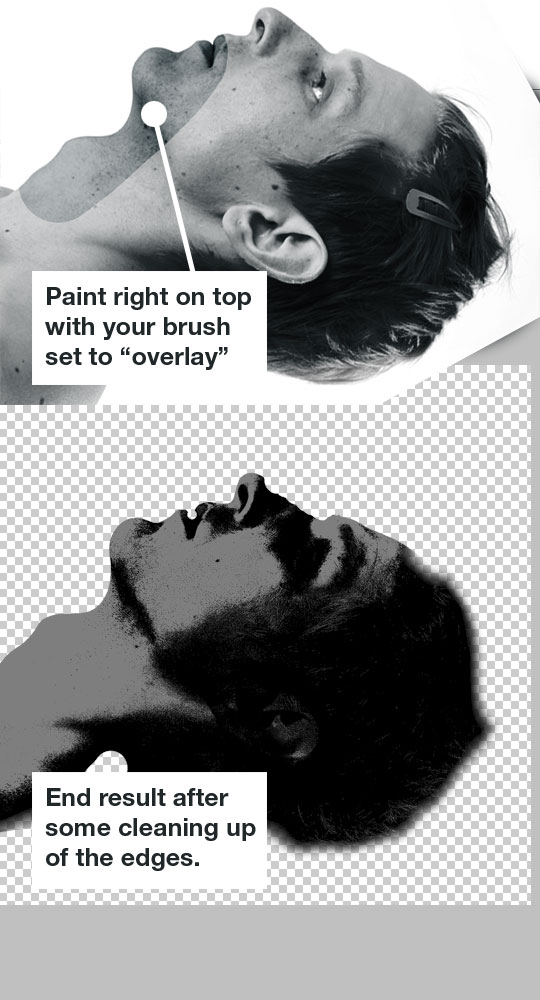
Now, I got that result above by accident. In fact I don’t even remember how to recreate that effect. If anyone else knows a better way to achieve that two-color grainy look, please let me know!
Screen out those darks
I put the head in it’s own group and set the layer to screen, so all the black parts would become transparent. I needed a dark background in there so I chose a darkish blue-green color. I also did a little cleaning up around the edges and made his ear less distracting.

Grain out the background
By default, I like to add a little subtle texture to my background layer. I’ll find some nice stock textures of film grain (thanks Simon!) or scans of dark colors in magazines and all the natural unevenness helps create a more cohesive look in the end.
You want to put this grainy layer right above your background color and set it to multiply or screen (or your choice of blending mode).
Put the gun to his head
This was looking pretty cool already, I almost wanted to just add the type and call it a day. But I was missing some of Adam’s core ideas. “What’s going on in his head?” This is where things got fun. I really liked the idea of putting the Howitzer barrels coming out of his eye sockets. That was my first choice, so I hunted around stock sites for images. I found a few that I thought were the appropriate angle and pasted them in and started cutting them out.

The 2nd option was getting there, but I wasn’t really feeling how it was laid out. And I also wasn’t sure of the usage rights on that image because I found it on Google Images which is usually a BAD place to go photo hunting. I just wanted to put life to an idea.
But no matter what I did, I just wasn’t feeling it. The barrels were too long or too off-balance. It wasn’t filling the negative space in his head in a way that felt right to me. So I tried to move on to another one of Adam’s ideas.
The raccoon on a treadmill! Perfect!
Raccoon on a treadmill = Design WIN
Anytime you can put a raccoon on a treadmill, your design is instantly awesome. So that’s what I thought! I found a great photo of a Racoon walking on Deviant Art and tried using that. I cut it out using my Wacom tablet and an eraser. This is a decent technique when accuracy or precision is not needed when masking out an object. Since the little guy was furry, I just used a soft brush with pressure sensitivity on to mask him out.

Once I got him masked out and into the design, I tried adjusting his levels and colors to match the overall piece. Now I needed to find a treadmill. But all I could find were modern looking treadmills that were too “fitness-ey” if you know what I mean. I wasn’t liking where it was headed and knew it was going to be a pain. So at this point I just scrapped the poor raccoon idea and moved on.
Finding the right solution
I tried the Bill Nye idea, but that was just awful. I chuckled as I gave it a try, but knew right away we couldn’t put his face in the art and expect our message to come across. I also tried a campfire and a few other things, but nothing was really standing out as a winner. What was going wrong here?
I took a step back, reread Adam’s email, and listened to the song again. I took note of “the devil is operating the machine” – reminded me of that scene in Eraserhead where there’s a disfigured man pulling levers by the window. The opening lines to the song read “Who says the words with my mouth? Who looks out with my eyes? Who hears the morning dove first? And only then the silence of the night?” It sounds to me like some sort of God or puppet master controlling your senses. The question is raised, “are we really in control?”
 I found the right solution.
I wanted to illustrate the idea of some mythical figure pulling the strings on our senses and memories without using the tired “puppet master” cliche.
Completing the Idea
I knew I wanted to make this “mythical figure” a silhouette a la the Rosemary’s Baby poster. With the head in the background and the silhouetted mountain and carriage. I found some various photos of models in “puppet master” or “spell casting” positions and thought this photo would do the trick:
I traced around the figure using the pen tool in Photoshop and created my silhouette. I freehand drew the mountain scape and placed everything together the way I wanted them. I made the silhouette darker than the background and also added a slight gradient behind it, so it sort of faded into each other near the bottom and wasn’t such a harsh line.
TIP: I also added some noise, Gaussian blur, and smart sharpen to keep it from looking so crisp.

Experimenting with Vectors
I was excited because we just released Vector Set 18 over at the Arsenal and wanted to see if could include some of our new “Infographix” vector pack. So I played with adding some in but I wasn’t quiet sure it achieved the effect I wanted. They sure did look cool though! But I wanted to make it a little more obvious that there was some crazy magic person controlling the senses.
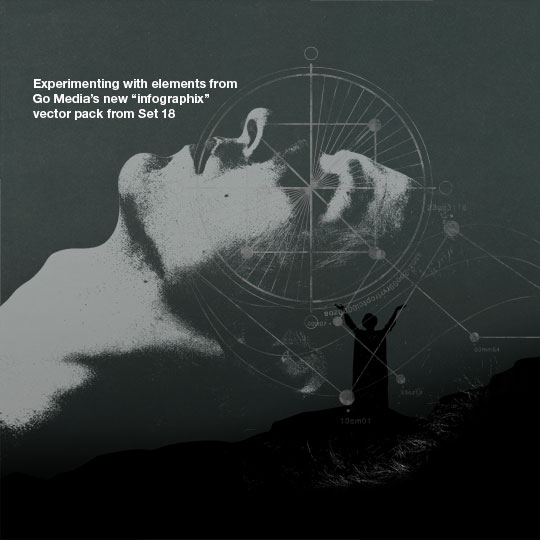
I scrapped those vector elements and decided just to create a simple graphic myself. I would circle the eyes, lips, and ears and connect them to the wizard’s hands. It sort of had that “infographic” look that I liked, but made it apparent that the wizard was interacting with the floating head.
TIP: I pulled a random grunge texture from the Arsenal and used that as a mask on my “circles and lines” layer. Just so I could beat it up a little bit and match the rest of the piece.
ÜBER NERD TIP: You can use ANY image as a mask! Open your texture, press Ctrl+A to select all and then Copy. Then go back to the layer you want to mask or distress. Add a new layer mask and then Alt+Click on the actual layer mask in the layers palette. You should now be editing your mask. Press Ctrl+V to paste and then click back on your layer thumbnail to exit mask editing mode. Voila, you should now see that your images black/white values are now acting as a mask!

Adding the Aura
While poking around my texture collections, I found a sweet texture from Resurgere and thought it might give this monochromatic design a splash of color.


Adding type
Now it came time to add the type. Well, in reality, I already had started experimenting with textures and color, but I’ll save all that for the end of this tutorial as the finishing touches. Truth is, I love playing with texture and color, and oftentimes I might do that in the early stages of a design to give all my elements a cohesive look as I’m working on it. But for now, let’s just focus on the type.
I had been using Knockout in a lot of my Parachute Journalists designs but admittedly was getting bored with it. It’s an amazing typeface, but I always feel the urge to try something new. This time I satisfied my craving for a tall, thin, condensed typeface by using Triple Condensed Gothic from Red Rooster.

That would be my title face and under that I’d pair it with an uppercase Helvetica Neue 65 Medium for Parachute Journalists. I wanted to include the band members so I completed the lockup with Mercury Small Caps with thin borders on the top and bottom to square things off. All of this was going to be really small anyway, so it’s really just for “texture” and not readability. The most important thing is the title and the band.
Also, I wanted to include more “type as texture” goodness. I wanted to add the lyrics somewhere in the design but didn’t care if they were readable or not. The goal was to give the entire piece an illusion of feeling bigger than it actually was. One way to do that is with really small type. I included the full song lyrics across the bottom in 4 equal columns. If you want, you can read the lyrics better here.

Adding one more piece
I really wanted to use one of the new vector images from our Infographix set, so I went back to it and found one. I was just looking for something subtle to add interest and centralize the whole piece. So I used another grunge texture to distress it and tastefully put it in the background after using a “color overlay” to give it an appropriate color to match the piece.

Texture Magic
Now it’s time to add some textures and bring the piece home. As I said before, I often experiment with adding textures throughout the entire design process, but for the sake of this tutorial I’m adding them all in at the end so you can see what they do.
Vignette
I create a new layer and fill it completely with white. Then I go to filter > Lens Correction and find the vignette option. I usually set the value to -100 and then tweak the opacity in my layer afterward. Once I’ve applied the vignette to my white layer, I set the layer to multiply and turned the opacity down to 50%.
Dust
There are lots of nice dusty textures out there, you just gotta find them. Eric Carl always knows a good texture when he sees it and has scanned in a bunch of vintage advertisements on his Flickr account. I used some of those to create my own textures and applied them like so.

Exposure
The image was pretty dark overall so I wanted to give it a boost. I opted for using the “exposure” controls instead of brightness and contrast. Why? Just for different results that’s all.
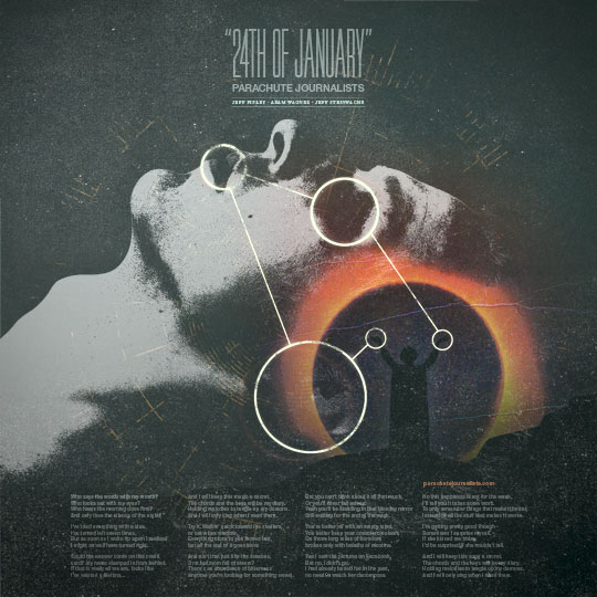
Colorization
I used a combination of hue/saturation, color balance, and color layers set to multiply and lighten. I was going for something cold and otherworldly here so I wanted to stay in the blue/green realm.


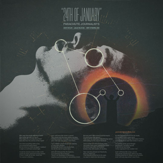
Final Image
I added one more layer of some whispy, blurred clouds, added grain, and put it on top. I set it to soft light and lowered the opacity to 50% and decided I was done with my image. Here’s the final piece:
Process Animation:
Just for fun I thought it’d be cool to animate the different layers building on top of one another in an animated gif. See below for a different look on how it all came together. It wasn’t as straightforward and easy as this final image makes it look!
