Blog
3D Typography in Photoshop

Introduction
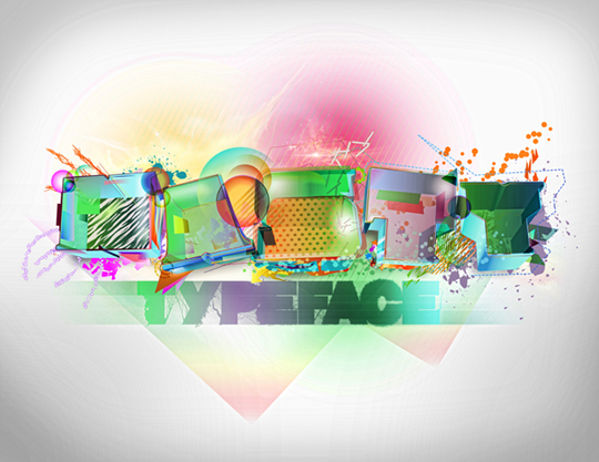
In this tutorial we are going to go over various techniques you may have seen before, as well as a bulk of techniques that may be new to you. After you have completed this intense walk though, I assure you will be able to explore even more new ways of creating typefaces as well as other types of ideas. Inspired by the work of Nelson Balaban as well as my own, I decided to re-create an old piece of mine using the techniques I am about to show. The completion of this effect will probably take around 8 hours collectively; however, once learned, the process shall be pretty easy and fast to replicate. Even though it is extensive, nevertheless it will be very fun and insightful. The final effect is shown below. Alright, lets do this fellas!
Lets Get Started
We shall start out by choosing a typeface that appeals to us the most. Personally, I love the new blocky typefaces we are seeing more and more nowadays. You can purchase many of them at myfonts, or look at the free ones at fontstruct (pretty amazing free fonts).
The typeface I have chosen for the image above (MOD) can be found here.This font is created by a great typographer named Svetoslav Simov. You may have noticed my font is very distinct from the actual MOD font created by Simov, due to modifications I made to the lettering in illustrator. We can now open up illustrator and load in any document size. The size of the document does not matter at this moment because we will be importing the finished illustration into Photoshop as a Smart Object.
Step 1 – Setup
Alrighty then. After we have chosen our preferred typeface, we shall proceed by expanding the text. This will make it an editable path. We will also load in the swatch file provided or choose to create our own unique color scheme. If you don’t know how to expand the typeface or load swatches, take look below.


Step 2 – Extrusion
After we have expanded out paths and loaded our swatches, we shall proceed with the handy extrusion tool located in the Effect Menu>3D>Extrude & Bevel. Normally we would want to extrude the whole entire phrase or word in one instance; however, we want to give life to the text by not making it seem so generic. For that we must extrude every single letter by itself, giving each different vanishing points. This will in end, make the letters seem like they are playing off each other and give life to the finished product.
This process involves working with multiple paths; therefore, we want to keep our work flow very smooth by creating a very organized Layer structure in Illustrator. Take a look (below) at how I go about organizing my layers and sublayers. Having all of these vector objects scattered all over the place can become cumbersome. I immediately moved each letter into its own layer and also added sublayers for extra effects that I knew I was going to add along the way.

What we want to do for each letter is to make an instance/copy of it by selecting a letter individually and hitting Crtl+C to copy , then Ctrl+ F to paste in front. For now we will hide the copies of the letters. Using the original letter, we shall now apply the Extrude & Bevel effect.

Ok, so this is where the whole technique becomes a bit more involved. Take the instanced letter you have hidden, and we will perform Alt+SHIFT+Ctrl+E. This command will load any last filter/Effect we have applied to the previous object. This saves us the hassle of going through the Effect menu and manually clicking on Extrude & Bevel again and again.
NOTE: This handy command will preserve ALL the attributes entered for the last object this effect has been added to. THIS IS WHAT WE WANT because we will do the same to the instanced letter but we’ll now add a closed cap extrusion rather than an opened one. Look Below.

Repeat this process we have described so far to the remaining letters. Remember to keep everything as organized as possible—after we have completed these steps repeatedly, everything could become confusing. This is were organization plays a big role. Take the time now to organize everything now if you have not done so.
Step 3 – Expansion
Hanging in there? Good! because now it gets super tricky. You’ll have to work hard to get this cool effect. Ready?
So, you might ask, why did we make two copies of each letter and why did we extrude them differently? Guess what, your questions are answered in this step. I’m going to explain this very thoroughly to the best of my ability so try to follow along.
We are going to now hide all the letters besides the N (If you chose to create a different word, you will now proceed to hide all the letters except the beginning one). Next, hide the EMPTY CAP extrusion of the N. This will leave us with the OPEN CAP N which was originally the first copy we placed in front and made the second extrusion to.
Now we will expand this version of the N and delete the extrusion part of it and leave the “CAP”. Note, since we have already expanded the typeface and added an effect to it, in order to make it a workable path, we must expand it once more. We will notice that now the expand option is grayed out. This is fine. We shall use the expand appearance option right below it – Object>Expand Appearance.
When expanded, we shall see that illustrator will created a group of different things that make up the Effect. To ungroup the expanded objects and to make it easier to located the shapes we want to keep or get rid of, we are going to: Expand the layer with the newly expanded extrusion! This is why turning the blend steps is key. The more blend steps we have, the more shapes we will have to work with. This will create a hassle undoubtedly.
- Ungroup all of the new objects by selecting the extruded shape and hitting Shift+Ctrl+G three times
- Find the shape that pertains to the cap (should be all the way at the top, inside the layer)
- Delete everything below the cap
- Add any of the green and blue gradients to the cap
- Turn down the opacity of the N cap to about 50-56%
Once these sub steps are completed, you should have an image like the one shown below.


Now when we delete all the unnecessary objects pertaining to the capped extrusion, we can see right through the inside of the letter when the opacity is turned down.
Step 4 – Expanding Empty Extrusion
First, we expand the empty N so that it will give us more flexibility and creativity when adjusting the colors and transparencies of the sides.
Now that we have completed the expansion process of the N, we are about to do the same to the empty capped N. Hide the Cap layer and select the empty N. Again, go to the Object menu and select Expand Appearance: Object>Expand Appearance. Now it gets tricky. It is best to follow the pictures so that you can get a better sense of what I am talking about. Now that we have expanded the N, and ungrouped all of the objects, we want to start joining our corresponding paths together.
I will explain the basic theory around this. Lets start with the far right side of the N. Essentially what we want to create is a continuous shape that resembles a particular side. If we were to apply a color the sides of the N, it would look weird and incoherent. This is because of the blend steps. You see, the extrusion tool uses an algorithm that applies gradients to the extruded edges to create depth, so when expanded (remember, the expansion tool makes everything that is being expanded COMPLETELY EDITABLE), the blend steps themselves become individual objects. So now, if we where to select the right or any side of the N, we would only select 1 of the shapes that create the whole entire side. For clearer understanding, follow the pictures.


Now watch what I do exactly below when I join the paths.
So basically, what I am doing is using the selection tool, choosing the side as well as the curve, navigating to the pathfinder tool located, Window>Pathfinder or Shift+Ctrl+F9, then using the Add to shape Area command within the pathfinder tool to join the end. Notice How I immediately click the expand button after I join the paths in the pathfinder floating menu. This allows me to make the new shape directly editable. Now I can add a continuous gradient throughout the sides. Essentially, this is what we want to do to every single side of the N.
Continue with step 4 and do what I have shown, to all of the sides. Just watch below as I go through and do it myself.
NOTE: When viewing the mini gifs shown above, don’t be alarmed by the color applied. The gradients look like they are separated into three parts. This looks that way because of the compression rate I used on the Gif files.
You might notice that sometimes when I joined the paths together they suddenly disappeared. This is because when we un-grouped everything, certain elements were scattered unevenly throughout the layers. This is no problem. After joining them, and they disappear, all we have to do is locate the layer/group they are in; expand that corresponding layer and locate the clipping mask. Delete this clipping mask and watch at amazement as your object re-appears. Now we can choose what ever color we desire. Don’t be confined to what I do. This is the part where everything gets fun for you. This is were you start being creative and adding colors AND transparencies you think will look nice.
Step 5 – Modifying the other Letters
You will have two choices now. You can either go ahead and repeat steps 2, 3 and 4 to each letter, or you can start adding your effects to your newly created letter. If you decide to apply this effect to all the letters now, your letters should resemble something like the image below. When you are done with this, lets meet at step 6.

Step 6 – Get Creative
Ok, so now that we have that hard work out of the way, we are finally going to have some fun with this process. This is the part of the tutorial were your creativity is welcomed most. You can say this is the post work in Illustrator. I can’t really teach creativity or give you a specific guide on how to think artistically for yourself; however, I can show you some of the techniques I used and teach you how to utilize resources to the best of your ability.
Now we are going to want to hide all the letters and work on just one at a time. With the caps selected, lets play around with the opacities, blend modes and strokes. One thing I particularly like to do is mess around with dashed lines. To achieve this effect we create a stroke, expand the stroke options and check dashed line. We can now set the length of the dashed line. I tend to keep the settings low and thin to get a notebook effect.

Next, duplicate the cap N, keeping it in front, lets choose a stroke and expand it. Delete the N and keep the stroke. Enlarge the newly expanded stroke and add a gradient you like. Do this as many times you want to create variety.

The expanded selection should look like this and now we can apply a gradient.

Continue experimenting with this until you are pleased.

Lets create circles, add any gradients we like and set blend modes to multiply. Create these separate elements in different sub-layers in order to keep them organized.

Now watch carefully as I create opacity masks to achieve nice fading effects. I’m basically making a shape, choosing a color I like, then creating another shape on top of it with a black and white gradient that serves as the opacity mask
Continue this process over and over again to create unique designs. Don’t just use circles, also experiment with other geometry. Also try variations of radial and linear gradients for the opacity masks to create distinct fading effects.

Now we will create variations of white spheres and give them a Gaussian Blur Effect to give the N some depth.

Apply the Blur and experiment with the Transparency settings as well as Opacity to blend it in better.

Now when you are satisfied with what you have, lets get a little bit more creative. Lets add some patterns behind the letter. You can come up with your own pattern, search the freebie section of Go Media’s Vector Packs and use those available patterns, check out Vecteezy for more elements or you can browse the awesome Arsenal collection Go Media offers. Once you have decided what you want, place a sublayer at the end of the N Main layer and place the pattern inside it.

Lets add some more spizzaz to our design by taking advantage of Go Media’s free brush pack. We can now use strokes with the shapes provided in the free brush pack to create intricate background designs. Mess ground with expansion and gradient to get the desired effect.

Now that we are done with the N letter, we can repeat all of the steps above to all of the corresponding Letters. After we are done, our eye candy should look like this.

We are now ready for some handy dandy post work in Photoshop. Save your work and proceed to the next step.
Step 7 – Post Work
Lets use a drag selection to copy all of our elements in Illustrator. We need to make sure none of our layers/sublayers are locked, or the finished product will look weird and incomplete inside of photoshop. Press Ctrl + V or Edit>Paste. An import dialog box should pop out in photoshop. We shall choose Smart object, that way all vectors are preserved.

NOTE: Transparencies are not transferable from Illustrator to Photoshop due to the difference in Blend Modes. In order to preserve the transparencies, you will have to import the text effect with a background from Illustrator. However, If you know how to import the imagery from Illustrator to Photoshop with corresponding transparencies, do share with us your method. I have often tried to export my image from Illustrator as a PNG then import it back into Photoshop, but that doesn’t seem to preserve anything either. I think adobe should keep the algorithm for transparency modes in all of their products the same for better compatibility between software packages….
Now that we have our work imported, we shall look for Nebula stock imagery to give our ‘Fruity’ text a futuristic feel. I used these stocks: Nebula 1, Nebula 2, and D.A. Moonchilde. With Moonchilde stock, make sure you credit her properly as she gives specific instructions on how her stock may or may not be used. I will not be covering too much texturing in this tutorial b/c I find that this text effect stands out better on a calm ‘n subtle background. Of course you can go crazy and add as many textures and images as you want, but that’s your forte.
Now that we have our text properly imported and our stock images chosen, we will begin by creating a vignette around the text. To do so, lets create a huge eclipse selection but lets keep it within the canvas. Inverse our selection, use the paint bucket tool and fill with black or w/e color is desired, Lets apply a Gaussian Blur to it with Maximum settings, and lets turn down the opacity to about 35% and now we have a nice looking vignette.

Now we want to add a shadow underneath the Letters to give the image more depth.

Lets give the shadow layer a Gaussian Blur effect of about 25.2 pixels and then lets decrease its opacity to about 57% so that it doesn’t look over saturated in black. Essentially we want a soft area shadow.

Lets some Diamond shapes. We will use the rectangle Marquee tool to create a square selection by holding shift and dragging along the canvas. Lets right click selection and choose Transform Selection, hold shift to snap rotation to 45 degrees, then rotate once. Use the paint bucket to fill the selection with white or whatever color you prefer.

Give the rotated square a gradient overlay of your liking.

With the ‘marching ants’/selection still active around the square, choose the marquee tool again and move the active selection about 35 pixels above the square. Right click, Transform Selection and stretch the selection out.

With selection in place, we will apply a Ctrl+Alt+D command or simply Select>Modify>Feather, and choose a radius of about 50 pixels. Hit apply then press delete. This create a smooth fading effect inside of the square/diamond.

Repeat this effect to your liking with same or different shapes. It’s always good to take risks and try new ideas.

Now lets add some nice glows to the background by creating 3 circles with different colors.

To make them glow, we will now add a Gaussian Blur Effect and play with opacities.

Finally, we will finish the piece by adding a subtitle below the word. I chose typeface, you can go with w/e you desire. We will give it a nice gradient that plays off the main title.


Now we duplicate the ‘Typeface’ layer by applying a Ctrl+D command. We will hide the Glow option but keep the gradient. Right click the layer and convert to Smart Object in order to retain the gradient information on to the type and get rid of the glow. This allows us to re-scale the position of the ‘Typeface’ object anywhere without the gradient changing. Now we will apply a Gaussian Blur and set blending mode to Soft Light 100%. This will now act as our glow pass for the ‘Typeface’ element.


Lets add some motion blur to the typeface. Duplicate the ‘Typeface’ layer once more. Again, disable the glow option but keep the gradient overlay. Convert to Smart Object and apply a Motion Blur.


Step 8: HDR Effect
Technically, the design is complete. Personally, I like to give an HDR effect to all of my flyers and typographical based works. I don’t use any expensive HDR image plugins out there, however when I get the money I will definitely get my hands on Topaz Adjust. It mimics what I basically do at the click of a button. This would definitely come in handy when tweaking something last minute. Oh well, I don’t have it, but if you do, use it to your advantage. I figured out a technique that would mimic the final output of this awesome filter.
So we will start out by exporting our file as a JPG image then re-importing it back into Photoshop. I like to do this rather than merging layers and or flattening my image, because I tend to save a lot. If I save while I have flattened the image I will lose everything I have worked on, layer wise. This is why I choose the Export JPEG option since it will flatten the image for me and preserve the 300 dpi or whatever setting I have it set to. You can also export to PDF, TIFF or whatever floats your boat. Just make sure the image is flattened.
Now we will duplicate the layer 4 times. Name one layer shadow, the other highlights, the other sharpen and the last isolation. Leave the BG layer locked as we will merge everything back to one layer when everything is done.
Hide all the layers but the shadow one. The go to Image>Adjustment>Shadow/Highlight… We want to bring out the shadows and dark areas.


We can now hide the shadow layer and un hide the Highlight Layer. We will now bring out the highlights.


Lets hide the highlight layer. Now we want to isolate the shadows from the highlights and vice versa. To do this, we will use the isolation layer. We will give it a brightness and contrast adjustment found Image>Adjustments>Brightness and Contrast.


Using the isolation layer, we will extract the highlights from the highlight layer and the shadows from the shadow layer. To do this use a Color range selection found Select>Color Range. Select the black area and then click ok. Now inverse your selection and apply a feather range of about 25. Delete your selection twice and now you have a layer with only shadows.

We will do the same concept with the highlight layer. Use the isolation layer as a map, use a select range option then click on the black area, instead of inversing the selection , leave it as is but feather it to about 20 and hit delete once. Your image should look like this.

Now we un hide both shadow and highlight layers and hide the isolation map layer. We shall now tweak the blend modes of these layers to create contrast. Make sure the highlight layer is above the shadow layer and the shadow layer is above the BG layer. The shadow layer should be set to Multiply with an opacity of 30%. The highlight layer should have full opacity of 100% with a blend mode of soft light.
NOTE: This technique tends to make the vignette very dark and saturated. To rid ourselves of this we will manually go in and choose a soft Eraser brush with an opacity of 40 and erase away until satisfied.

Last but certainly not least, we will add a High pass filter to our sharpen layer to create the HDR look. We will end by setting this layer to Linear light with an opacity of 46%.


These post-processing techniques will vary between the size, colors/brightness and contrast of your works. With that said we conclude this overwhelming tutorial.
Download all of the files used in this tutorial here: [download id=”47″]
For the PSD, I can’t provide the stocks I used as I am not the rightful owner who can re-distribute the stocks. However, I have provided the links above so that you can find them yourselves. I hope this tutorial was helpful and I hope to see this technique replicated and tweaked artistically. I encourage you all to use this tutorial in your own work and I would like to see some nice emulations of this typeface in Go Media’s User Showcase on Flickr.
Hope you found this tutorial useful; happy designing!