Blog

How to Design an Iconic and Memorable Band Logo
My new (pop punk) band Campfire Conspiracy was gearing up to play our first show and I had two weeks to finally come up with a logo and get it stenciled or painted onto our bass drum. We had a demo coming out in only one week and we still didn’t have a logo. I’d been putting it off, but now was the time. I needed to have something before we finally went live.
Side note: Check out my other tutorial on designing custom die-cut stickers.
What followed was actually a very interesting logo design process that started from absolute scratch. I had zero idea of what I wanted our logo to look like. Should it be a campfire with some grunginess to it to show that we’re a punk band? I didn’t have an answer. I thought about it for weeks, but nothing inspired me so I went to Twitter and Facebook.
But first, here is the final logo I ended up with.
![]()
Process Documentary
If you don’t want to read the post, you can always watch this awesome video made by my friend Keith at Jakprints.
Step 0: Research (Ask Facebook)
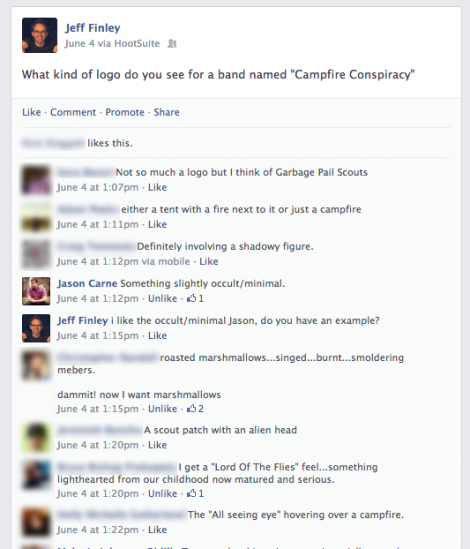
I got a reply from a fellow designer Jason Carne who suggested something minimal and occult. I was immediately drawn to this idea and when he sent me an example, I knew this was it. He even drew up a quick sketch of a campfire with a book and a tent and said, “something like this.” Hell yeah.

Ok, I was inspired. I knew I wanted something minimal and occult; but bands with logos like that tend to be metal, right? We were pop punk, how do I communicate that?
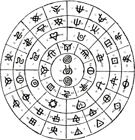
I didn’t know much about occult symbolism, hieroglyphics, sigils, alchemy, runes or anything. I went Googling and came up with all kinds of cool stuff. I started making a Pinterest board to archive my inspirations. I searched Pinterest and found even more cool images. I even looked at books referencing occult symbolism, conspiracies, the Illuminati, the Freemasons, etc.

I realized I was deep in the rabbit hole once I got to Aleister Crowley, sacred geometry, and mysticism. I even received messages from people on Facebook telling me to be careful with what I research, I might disturb something in the ether! Ok enough research, time to make something cool!
Step 1: Sketching
I had boards and boards of inspiration and I knew enough to just start drawing. I spent a few hours at a coffee shop sketching and sketching. Drawing symbol after symbol until my hands were too cramped up to go any further.
I stared at my sketches and nothing was sticking out. I was paralyzed with doubt and fear about how this symbol might be perceived. Was it clear enough? Was it too obscure? Or not obscure enough? Are people going to think we’re devil worshipers? Haha. (My Mom even expressed concern for me).

Since I couldn’t decide, I went to social media again. I posted my sketches to get some feedback, and boy did I get it. Designers and non-designers alike were offering their two cents. They tried to tell me which one they preferred and it was clear that a few different sketches were standing out. I understood what was getting a reaction out of people and this is where I decided to take the next step and go into the computer and work on cleaner vector versions.
Step 2: Refinement
I took the basic concept and worked on multiple permutations from overly detailed to extremely minimal. How much could I get away with? If I took away too many elements, did it still communicate Campfire Conspiracy clearly? Do I even need to be literal at all? I wasn’t sure. I couldn’t decide for myself. I had such a good response from posting my sketches online so I decide to post my refinements online as well. This time I made it easier for people to tell me which ones they preferred by labeling each one.
![]()
Designers’ Tip: Creating this logo was not technically hard from an execution standpoint. It’s all just one uniform stroke weight with basic circles, lines, and squares with nice alignment and symmetry. I never used the pen tool once. However, I did make sure my angles were geometrically sound. Meaning sums of 30, 60, 90, etc. Or all evenly divisible by 360. The fire was created using the Zig Zag effect under “Distort & Transform.”
I posted this to Facebook, Instagram, Twitter, and Dribbble. And after a day of feedback I tallied up the results. Over 130 votes in all and there were a few clear winners. People preferred the symbol inside a shape – whether it was a square, diamond, or circle, it didn’t seem to matter. Curiously, the more detailed it was, the more people liked it. Which went against my intuition for a logo – it felt more like a badge at that point. But still, it was very simple and iconic and not overly illustrious.
Step 3: More Refinement
So I took the clear winners from that round and posted ONE final round. I gathered the top five concepts and put them up online and people were more than happy to provide their opinion. Each of these concepts were very similar, but there emerged one clear winner. The logo with the circle around it was definitely the most popular one. And I agreed.
![]()
The Final Logo and Beyond
I went back into Illustrator knowing exactly what I needed to do. This was an amazing feeling knowing that I was working on the right logo and wasn’t guessing. Sure, putting your logo design out there for fan feedback isn’t always the best idea but I think it worked here. I was curious along with my audience. I loved having them give a hand in the process.
I made a few refinements to the symmetry and balance of the logo and voila, I was done. I added a roughen filter to give it a slightly grungy look which fit with our band. It’s so subtle you barely notice it.
Concerns
I had some doubts about the logo being too metal or dark when we play catchy pop punk songs like early Blink-182. I asked Adam Garcia, the designer who worked on the alternative hip hop artist Astronautalis (both are appearing at WMC Fest 2013) – who happened to develop some occult looking symbolism for him. He said it doesn’t matter if it crosses or bends genre stereotypes. People are too stuck into “this is what hip hop is supposed to look like” – you know, with graffiti, bling letters, or this and that. Just do whatever the fuck you want he said. That’s some advice I can get behind!
So I didn’t worry about it anymore after that. In fact, as long as I stood away from making it too black and white and made sure to use some color, I think it would steer clear from an obvious metal perception. The truth is, nobody cares about my band anyway, so does it even matter? Just do whatever the fuck* you want.
Expletives are for emphasis. Seriously, I mean it.

The Logo Makes its Live Debut!
Once the logo was designed, I literally had two days before our first show and needed to replace the bass drum head that still had the old band’s logo on it. We spray painted it black and when it dried I got some acrylic paint and a brush and went to town. I thought it would be a piece of cake painting the symbol onto the drum head. It was harder than I thought it would be!
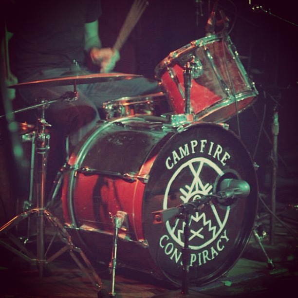
I took a black marker after the white paint dried and touched up the sloppy edges. In the end it came out slightly imperfect, but that was ok. To me it still felt authentic and true to the cult-like idea of the logo. If a regular person (not a trained artist) was recreating this logo, it would never be perfect.
DIY Music Video
Shirts and Hoodies!
The fine folks at Jakprints demonstrated their one color silk screen t-shirts by printing this logo onto some shirts and hoodies. Here are some pics!


Sticker Time!
I sent the designs off to Sticker Robot and was hoping I could get some custom die cut stickers made. I didn’t want just one sticker on a sheet, I wanted four. In a diamond shape! So I set up my design file with how I wanted my stickers arranged. They ended up giving me feedback on my bleeds and after a few adjustments I got the spacing worked out just right. That’s how cool these Sticker Robot people are, I didn’t know how to set up my file and they were willing to help me out to make my dream come true. Awesome.


Stenciling!
I sent off the design to Jeff Nemecek at Purebuttons/Standout Stickers and he used a robotic laser cutter to make a couple stencils for us. Now the trick to making a stencil work from your logo is putting in the “bridges.” It’s kind of hard to explain, but this tutorial on Abduzeedo does it so much better.


Wrap up
A cult symbol should be intentionally easy to create but hard to forget. Something people could easily draw themselves to communicate that they were part of the cult. While our band certainly doesn’t have a cult following (yet!) it was extremely fun to experiment with something like this and equally cool printing up some band merch. I learned a lot about occult symbolism, storytelling, and not giving a fuck. I think this project was a success. I hope you can learn from it!
Connect with us:
Subscribe to the GoMediaZine newsletter