Blog
Old School Type – Line Gradients
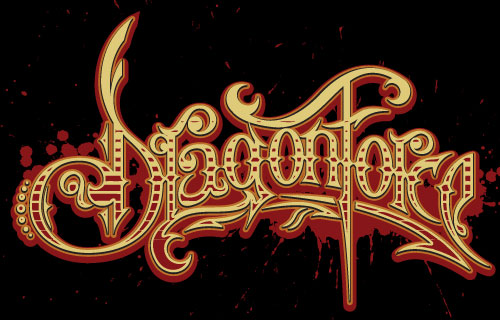
One of our readers suggested we write a tutorial explaining how to do this cool text effect. On the Dragonforce logo above, the basis of my typography was sketched on paper first and then vectored in Illustrator using the Pen Tool. The process for creating the base logo is not included in this tutorial. Instead, we are going to take the base logo and add that cool “line gradient” effect that you see inside the actual letters. This gives the text an old-school or vintage feel to it. This look is prevalent in wood engraving and sign lettering. You can do this effect with any typeface or font because the principle is the same.
Here are some more examples:


So in order to get this effect, we will need both Adobe Illustrator CS2 or higher and Adobe Photoshop.
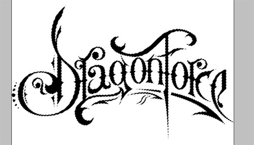
You can see the kind of effect we are going to create. This is going to cover the basic technique. But I encourage you to be creative and experiment with different things. That’s how you learn! Begin the tutorial after the fold.
Step 1: Prepare your base logo or typeface.

We will use our Dragonforce Logo as our base, but you can simply use your favorite font. Just make sure it’s thick and bold to make room for the line effect.
1a: Open up Adobe Illustrator and Photoshop
1b: Create your base text (just type something out using a bold font)
Step 2: Make a new document in Photoshop

You’ll need to make a new document in Photoshop that’s 2500×2500 pixels and 300 DPI. This will be where we will create the line gradient. But first, we need to get your text into Photoshop.
Step 3: Back in Illustrator, select your inner most shape in your text and copy it.

If you’re just using a font, simply click on it to select it. Press Ctrl+C or Edit>Copy to copy the shape to your clipboard.
Step 4: Paste it into your new Photoshop document.

Switch back into your Photoshop document and press Ctrl+V or Edit>Paste to paste your text layer. It will ask if you want to paste it as a Vector Smart Object or as Pixels. Choose pixels.
Step 5: Make the text black.
If your text is already black, skip this step. You can either use brightness & contrast, levels, or whatever you want to make your text black. I did it by Ctrl+Clicking on the layer’s thumbnail image to make a selection around my shape. Then I pressed “D” to reset my colors to black and white and then Alt+Backspace to fill my selection with Black.
Step 6: Give your layer a white “inside” stroke.

Go into your layer properties and give your black text a white stroke. Align the stroke to the “inside” so that it looks like it eats away your text. You’ll see why we are doing this later.
Step 7: Isolate JUST the black layer by using Select > Color Range

From your menu up top, find “Select > Color Rage” and press OK. This should have already selected all the Black pixels by default. If not, you can choose “shadows” from the drop down menu. Once you have the selection made, make a new layer and press Alt+Backspace to fill the layer with black. You can then delete your previous layer with the white stroke. What we just did in the last few steps was make our text “thinner” so our line gradient has some spacing away from the edges of the text.
Step 8: Create your gradient and convert to Bitmap
8a: Ctrl+Click your new layer with just the black “thinned” text to make a selection around your text.
8b: Use your gradient tool to create a black and white gradient from bottom to top of your text.
8c: Select Image>mode>Grayscale – if it’s not there already
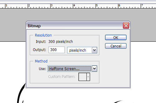
8d: Once it’s in Grayscale mode, select Image>Mode>Bitmap and then you’ll get a series of dialog boxes.
8e: Select “Halftone” screen from the dialog box. Make sure your resolution says 300 DPI.
8f: Select a frequency of about 6, angle of 0 degrees, and Shape of “line” – these settings determine how our bitmap will look. Feel free to tweak these to get whatever effect you want.
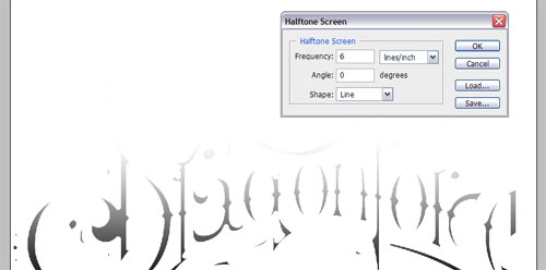
This what we have created after converting the gradient to a bitmap:

Step 9: Take your image into Illustrator to live trace it!
The easiest way to get your image in Illustrator to Live Trace it is to drag and drop it. So select your Move tool in Photoshop and physically drag your artwork onto the Illustrator button on your taskbar. With your mouse button still held down, hover over the Illustrator button on your taskbar until the Illustrator window pops up. Now you’ll notice that your icon will change when your holding it over the artboard in Illustrator. Let go of the mouse button and your image will be placed into Illustrator. It will most likely be really big and you’ll need to zoom out a bit to see it.
So with it still selected, click the Live Trace button up top, or go to Object>Live Trace. Then click the expand button after that.
9b: Once you have it Live Traced and expanded, right click and ungroup your newly live traced shape. This will separate all the black shapes from the white shapes.
9c: Click on white area around your text (you may not see it, but it’s there) to select a white shape. Then go to select>same>fill color to select all your white shapes. Press Delete to get rid of them. You only need the black shapes.
9d: So now that you’re left with just the black shapes, select all of them by dragging a large selection box around it. Once they’re all selected press Ctrl+G to group them.

Step 10: Scale down your new vectored line gradient and fit it onto your base text

I scaled it down and tweaked the size so it fit perfectly within my original base text. I changed the color to match it. I ended up with my final image below. That’s it!

Conclusion:
In this tutorial you learned how to use Photoshop and Illustrator to create cool looking “Vector Line Gradients” to give your text a vintage “old-school” feel. This can be applied in lots of different ways including background gradients or halftones. In fact, in Go Media’s Vector Halftone pack in Set 3, you can choose from a variety of premade line gradients which you can use with just a little bit of work.
I encourage you users who follow this tutorial to post your designs in our user showcase to show off what you’ve learned.
Oh one cool tip to get some rad halftones is the Andromeda Screens filter. Check it out and play with it. Some of those designs you see below with the curvy line gradients were created with it. It takes some getting used to, but it’s cool.


