Blog
Some Like it Dirty: Comic Book Inking and Coloring Tutorial

Comic Book Inking and Coloring Tutorial
Earlier this year I was commissioned to come up with a series of character illustrations for Cohort Pictures new film project; ‘The Northern Mist‘, a suspense horror set during the Roman occupation of Briton. The illustrations would be used to help the rest of the creative team cast the roles for the film, aid in costume design and provide a bit of promotional material to drum up interest from investors and audiences. It was a great chance to really flex my creative muscles and get into some good ol’fashioned doodling. My favourite piece to come out of this one was what I nicknamed the Lady Briton sketch, so I decided to run a quick step by step tutorial for anyone interested in how I took this illustration through from brief to final concept.
The Brief
So the brief for this character went something like this (and this is me paraphrasing pretty extensively)-
“she’s a feisty female Briton, easily equal to her male counterparts, she get’s captured early on in the film so it’s important to try and get her fighting spirit across in the design as much as possible. Also- she is the only female in a movie full of dudes, so she really needs to not be a troll.”

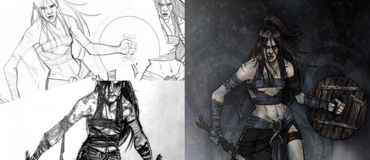
After a bit of pleading, Patrick (the director working on the film) also sent me through this rough sketch he’d put together. It makes such a difference getting some rough input from a client as it means I have a starting point- even the crudest stick man helps me to get a result closer to what they originally envisioned. Anyway – from this, I gathered she needed to be in pretty light armour, probably leather or cloth and covered in dirt. Nice.
The Concept

The next step is getting a rough sketch together. My initial sketches are always pretty awful (I think I drew this one whilst on a bus in Spain?), but the point of them is very much like the concept Patrick sent me: to quickly get an idea across. If you spend any massive length of time on them, then (if you’re like me) you’ll resent any changes that need to be made, at the end of the day: time is money after all. In this version, Patrick could see I’d gone for a cloth wrap that showed off more skin in a way that wasn’t too obviously sexual, and made the hair very loose, long and straggly. I also gave her two swords, but Patrick felt that a crude sword and shield might work better, so we went with that.

The developed sketch turned out like this. I tried to stay aware that whilst this character needed to be feral and wild, she also had to be quite attractive in her own way. To keep that appeal in there, I pretty much sketched her naked outline and started adding clothes after so as to keep that core feminine silhouette to the design.
Inking

Once that got approved I moved onto inking- I ink right on top of my pencils, but I always make sure to have a scanned copy at a decent resolution just in case I slip up. A lot of top inkers recommend brushes to help you get a good line weight into your artwork, this can make your drawings a lot more dynamic and it really helps to give a sense of depth. Originally I just used digital inking via my Wacom tablet, but at my first comic con in Boston, a few editors from DC comics tore my portfolio apart, saying I had great talent but I really needed to use brushes to ink my work. Since then I’ve tried my best to use brushes, but as with all things it’s easier said than done and I ended up ruining a few sketches with spilt ink pots and the like. Now I’ve found a happy medium in the Pentel Brush Pen- which is what it sounds like; a pen with a brush nib. I think it’s designed for Chinese calligraphy or something, but to my mind, there is no better pen out there for inking your artworks (at least for the major lines anyway).

So now my inks are nailed down, it’s time to erase the pencil underneath and get the inks scanned into Photoshop. I use the Levels Tool (Ctrl+L) to try and clean up my image a bit and get rid of any paper grain. Basically I just move the black and white cursors a little closer to the centre until I’m happy with the definition I’m getting. It’s useful to zoom right in here to make sure I don’t have any pencil trails still knocking about. A trick I sometimes also do (but not for this piece) is run my linework through a Live Trace in Illustrator, then just save it as a PDF and open it back up in Photoshop. This can really help smooth out my lines and can make a huge difference if I’m going for that ultra polished look.
Colours

For colour I generally duplicate my line layer and set the top one to multiply. For the lower level I go to Select > Colour Range and choose black to select all the lines. Then Select > Modify > Contract and contract by one pixel. Now I invert the selection and delete. This means that the lower layer (which will become my colour layer) has slightly thinner lines than my top layer. This way I can just use the paint bucket tool on my lower level to quickly fill the areas I need with colour. The downside of this is that the lines on the lower layer are now very jagged, but fear not- that top layer is still perfect and will keep the ultra smooth lines. Smart.

Shading wise I do love my gradient tool, but I’m trying to broaden my horizons and so, with that in mind, for this piece I decided to use Copic Markers. Now I’m no pro with these things yet, but I’ve seen some amazing artwork from guys like Adam Hughes and Mahmud Asrar, so I figure it’s well worth my time getting to know them. They’re basically watercolours in a pen minus the mess (are you seeing a pattern here?). Seeing as I wanted this piece to be really gritty, I figured it didn’t matter too much if I wasn’t perfect yet as it’d probably add to the effect I was trying to achieve anyway.

So here’s how I work- I go back to my inks in Photoshop and place a ‘screen’ layer over them and fill it with Non Photo Blue (#A4DDED – thank me later), this changes all my inks to a special type of blue that is really tough for scanners to pick up (meaning the lines won’t show up as much when I scan it back in and I’ll just have my sexy Copic shading). I print this out and then start going over it with the Copics. I only use grey as I already have my basic colours in Photoshop. Copics have two types of grey- warm and cool. Warm is generally for skin and ‘warm’ things, and cool for clothes and ‘cool’ things (duh!), however, for this character I really wanted to make her as pale and cold as us Brits really are and so I swapped them over, using cool greys for the skin and warm greys for the clothes. This contrasts well with the olive skinned Romans I illustrated later.

So the technique I use is just to start with my lightest colour and keep adding until I’m happy. I apply each colour a few times to get really slight gradient differences and then switch up a pen for more defined shadow and light sections. Another cool tip is don’t worry about going outside the lines- we have our perfect inks saved on Photoshop now, so if needs be we can always use that as a mask to clean things up.

Some other gadgets I have are these Sepia pens. Again, these come in warm and cool greys. They’re not quite as washy as the copics but they have a much finer nib and are great for detail.

I use these for any sections that need real precise details like on the leather strips or strongly defined shadow. They’re great for hair as well.

Finally I have a couple of white ink pens for highlighting any areas. Generally I like to do this digitally as these inks can run a bit, but sometimes it can be helpful to get the whites in whilst I’m ‘in the zone’ and am pretty familiar with the illustration and lighting etc…

Now for the fun part; get the Copics scanned in and throw them into Photoshop.

I grey-scale them up with Ctrl+Shift+U to get rid of any colours that have shown up (or not if I like the effect, I call it as I see it depending on the illustration).

I put this layer above my colour layer (but below my smooth ink layer) and set it to multiply. What I’m left with is my digital colour mixed perfectly with my Copic shading. Sweet.
Finishing Touches

Now is the time to take a good look over the illustration. I often notice some bits I want to be darker or lighter. Not to worry though, I just hide the Copic layer and start editing my original colour layer. I wanted the eyes much darker and I think I wanted the clothes to cast more of a shadow too, so all I did was highlight those sections and darkened them with either the Lightness Bar on the Hue/Saturation Panel (Ctrl+U), or with the Gradient tool set to black.

Likewise I wanted to brighten up a few sections, like on the sword, so I did the same thing but with white. When I’m creating a glow or a shine, I make sure to do it on a new level above my smooth inks, stuff like this really helps blend a work of art and brings a piece together.

I know what you’re thinking- “this chick is way too clean, where’s all the mud we were promised?”. I know, and I’m way ahead of you. I have this great texture in stock from Go Media Arsenal Grime Set 2 pack, I think it’s actually concrete, but it works really well for adding a natural, dirty looking texture to things. Normally when I’m working with textures I like to desaturate them so they taken on the colours of whatever layers I apply them to, but in this case I thought the bluey grey colour worked pretty well (having flashbacks to Braveheart!) so I decided to keep it as is.

To apply the mud effect I simply throw it on above the colour layer, delete any part that isn’t over the skin and set the layer to multiply- this ensures that all the dark bits of the texture stay dark whilst the light bits show through the skin colour underneath. After that it’s just a case of playing with the opacity to get the muddiness to a level I’m happy with, I think I opted for around 50% opacity in this piece. Another cool trick I do here to add a bit of depth and volume is to select the erase tool and a really soft brush with a low opacity and just go to work erasing bits of the mud texture on the parts of the skin that would be either naturally lighter or catch the light (since the mud layer is set to multiply, and only the dark bits are showing through, erasing them will make that area lighter). In this case I erased around the shoulder and hips, as well as on the top of the thigh to make those areas seem a bit more rounded and curved.

Now the brief asked for a character illustration and didn’t really mention anything about backgrounds, but I work to the Bill Beachy mantra of “under promise and over deliver” so whilst not going overboard I am going to try and produce a background that’ll help set the tone for this illustration. [Note: Bill Beachy is also the mastermind behind the best web design firm in Cleveland, Go Media.] The basis for the background is very simple. Another texture from Go Media’s Arsenal, this time from the Rust 3 set with a blue tint and a black gradient coming in from above. I’ve also included just the hint of a pattern from the tribal vector pack in order to make that background a bit more dynamic. Also since the illustration is for a movie called ‘The Northern Mist’ I figured it’s probably a safe bet to put some mist in there too. This is basically created on a layer above the background (but behind the character) by using some of the sexy Smoke and Cloud textures from the Arsenal. I use a few of these mixed together and set the layers to ‘screen’ (removing any blacks from the texture and just showing the white misty goodness), this gives a sense of volume to the mist in a very authentic (and quick!) way.

To add a bit of depth and to create a foreground, I duplicated the mist layer and moved it above the character illustration to give the appearance that my Lady Briton was stood amongst the mist rather than in-front of it. I also added a bit of light in the top left corner to help show off a bit of light direction and some cheeky dust particles to make the light look a bit more dynamic and to add extra depth. One last cool little trick I did here was to put all the character layers in a group (Ctrl+G) and then apply a gradient mask to that group from the ground up, effectively fading out her feet. The result of which made her look as though her feet were disappearing into the mist, but still allowed me to keep the mist fairly fine.

So there it is, my finished Lady Briton illustration. Patrick and the guys from Cohort Pictures were really thrilled with how this, and the other illustrations turned out. In fact, they even hired me again right away to produce a short comic book in lieu of the traditional storyboards, so that they could use it as a marketing tool for the film!